

One, I know that the white text on black background was hard to read. (Even though I'm sure most people are using RSS Feeds now, but still...)
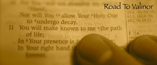
Two, I've been diving deeper in my posts, and wanted something a little more representative of what I'm posting. So, I wanted to replace the goofy laugh-at-the-sky photo. Psalm 16:11 (banner photo) is very apropos for my "Road To Valinor" theme, and I like it.
I also had a little fun making the photo. Check out this neat, free little webapp: Tiltshiftmaker. Basically, you upload a photo, and then it adds a blur effect to make your "focus" pop out more. Here is an example of a before/after attempt I did. These are the houseboats we stayed on for the senior trip to Lake Mohave I chaperoned with WCHS. Notice how the tiltshift one makes the boats looks like models or toys?

Monday, January 12, 2009
Rennovation
Subscribe to:
Comment Feed (RSS)
|